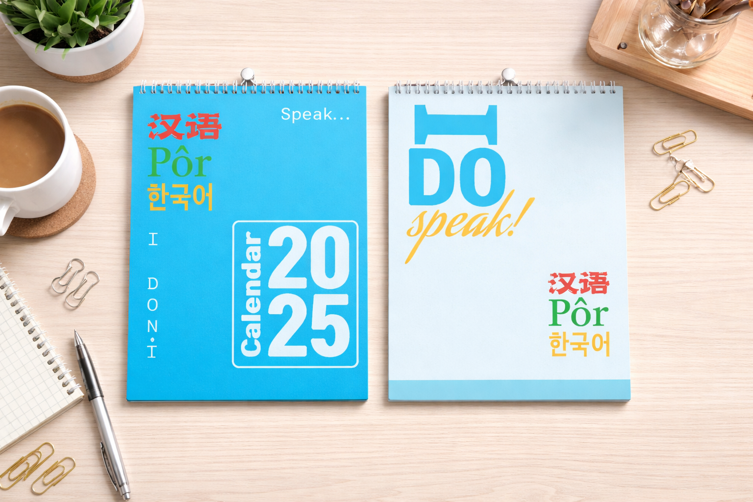
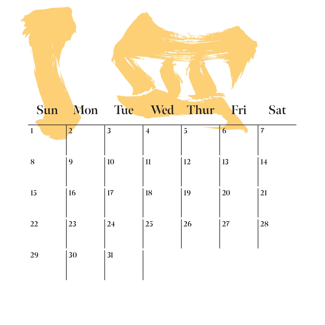
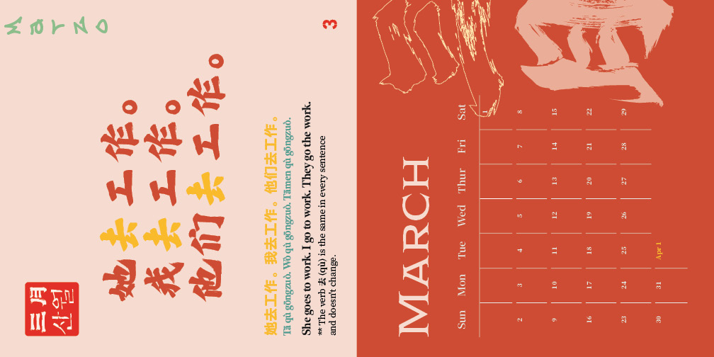
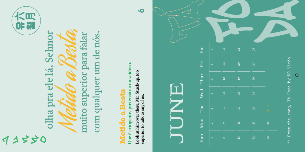
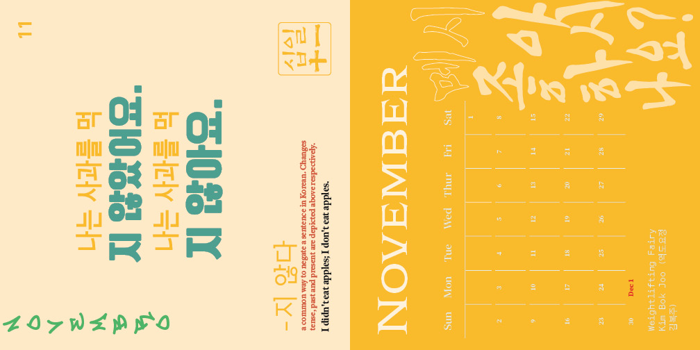
I Don’t Speak is a 2025 multilingual calendar created for my Publication Design course, where students were challenged to transform a functional object into a visually compelling artifact through typography, grids, hierarchy, and cohesive systems. For this project, I designed a calendar inspired by my personal language-learning journey with Korean, Mandarin, and Portuguese. Each monthly spread combines educational phrases, grammar lessons, and culturally inspired visual elements, turning the calendar into both a timekeeping object and an interactive learning experience. The final piece includes 28 pages: front cover, back cover, fun page, and 12 monthly spreads. This project demonstrates my ability to merge editorial design, typography, and storytelling into a unified publication.
When first thinking about the idea for this project, I thought of my language learning journey with Korean, Mandarin, and Portuguese. I wanted to incorporate the different phrases and grammar points that I had learned throughout the years. From the start, I knew I wanted to incorporate elements from each language into my design.
For example, I explored the vertical writing traditions and brush-like calligraphic style of Mandarin and Japanese-inspired typography, the bold and recognizable colors found in each country’s flag, and the playful rhythm of spoken language through layout and hierarchy. I also researched how educational books and beginner language workbooks present vocabulary in a clear and approachable way.
This inspired me to pair each month with practical phrases, translations, and pronunciation guides so the calendar could function as both a design object and a language-learning tool. My goal was to make each spread feel visually tied to its language while still maintaining one cohesive calendar system throughout the year.
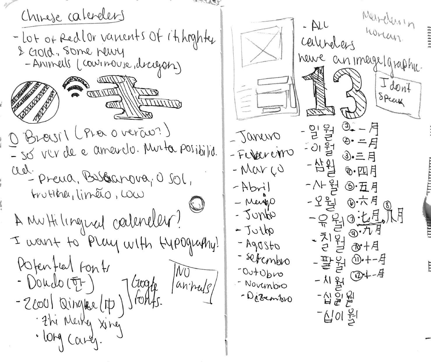
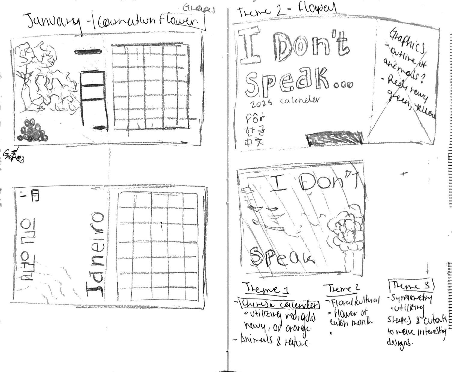
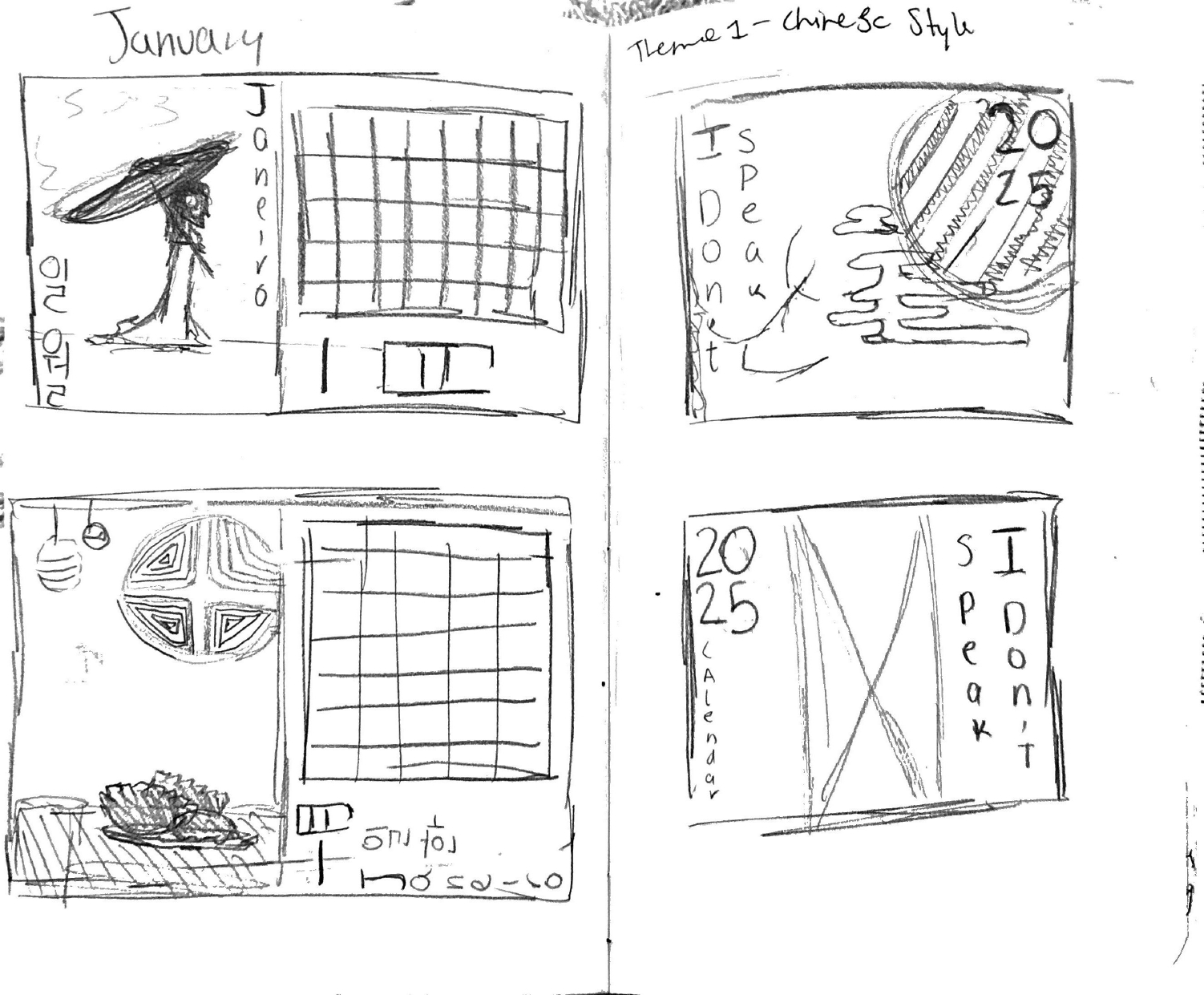
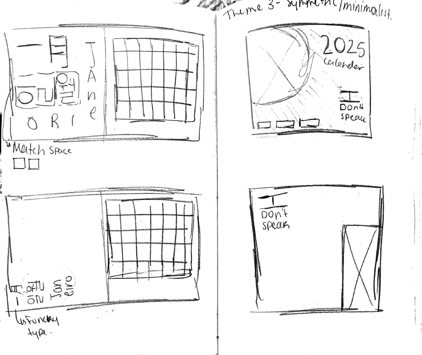
My biggest challenge with this project was having too many running elements for my designs.
Essentially, I was designing three calendars in the packaging of one. As shown by my early sketches, I had many ideas ranging from adding iconography like clouds, animals, and seasonal references inspired by Chinese Lunar New Year traditions.
Another challenge was choosing the right fonts since I would be working across multiple languages. This was my first time designing with a non-Greek alphabet, so I had to carefully source fonts that supported Chinese and Korean characters while matching the proportions and personality of the Latin typefaces I selected.
A later challenge was the scale of the project itself: 26 pages total, including front and back covers. At times the workload felt overwhelming, but I managed it by building a clear design system that allowed me to work efficiently from month to month.
To tackle these design challenges, I started by creating a design system and layout. I designed the cover image and the January spread first to establish the colors, placement, typography, and visual tone I wanted for the full calendar. This gave me a template I could adapt across all remaining months while still allowing room for unique content and phrases.
I built the calendar grids using tables in InDesign and created character styles for recurring elements such as month names, dates, translations, and pronunciation text. This system helped me maintain consistency while speeding up production. Once the structure was complete, I focused on refining each spread through color adjustments, spacing, hierarchy, and balancing decorative elements with functionality.
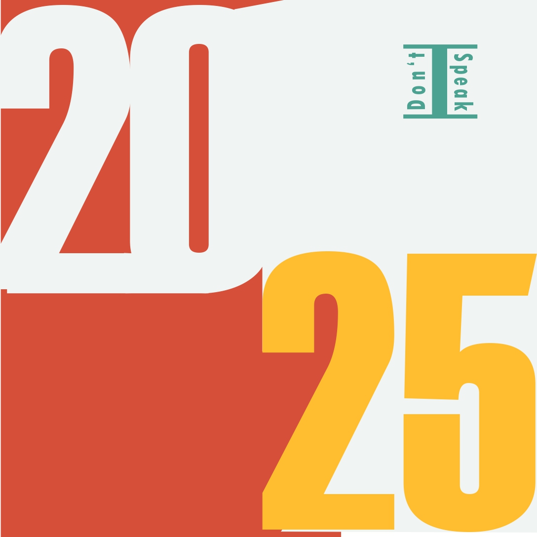
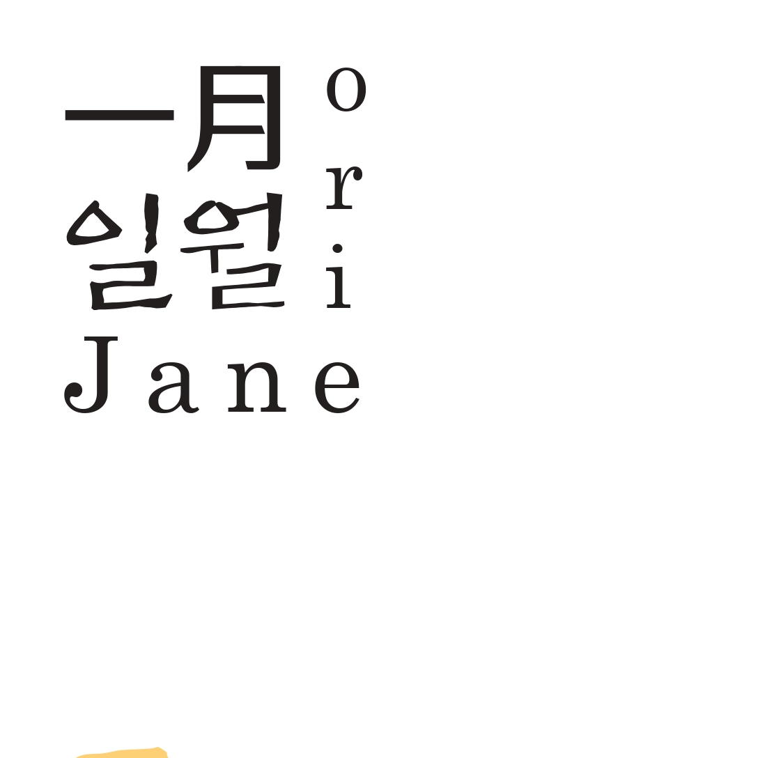
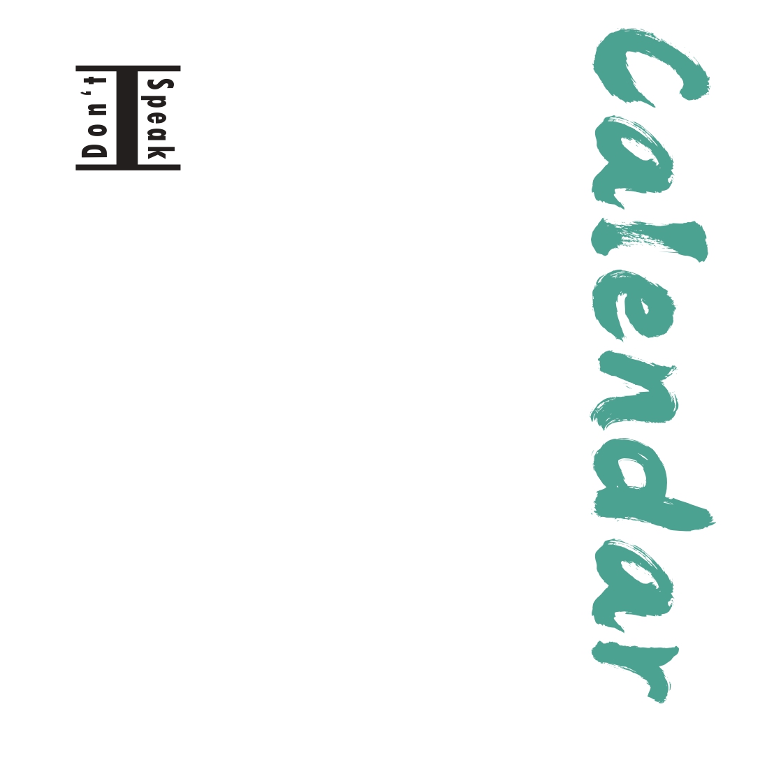
This project taught me how powerful systems-based design can be when managing large editorial projects. I learned how to balance creativity with consistency, especially when designing across multiple pages and languages. It also pushed me to become more intentional with typography, hierarchy, and pacing.
Most importantly, I Don’t Speak became a personal project that reflects both my design growth and my love of language learning. It transformed a simple calendar into something educational, cultural, and visually engaging—making it one of the most meaningful projects in my portfolio.
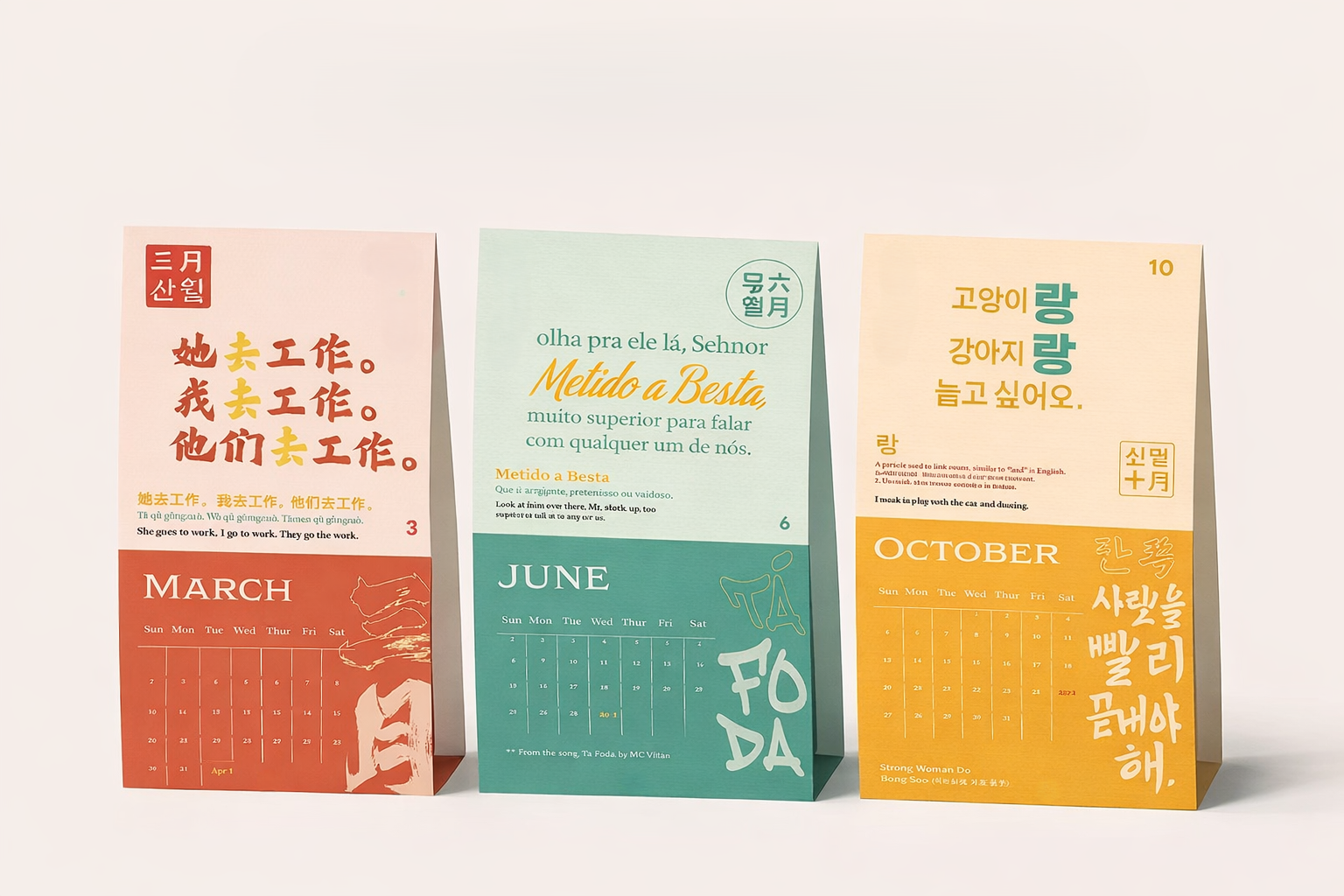
AI was used for the generation of mockups. However, all designs and ideas are original.