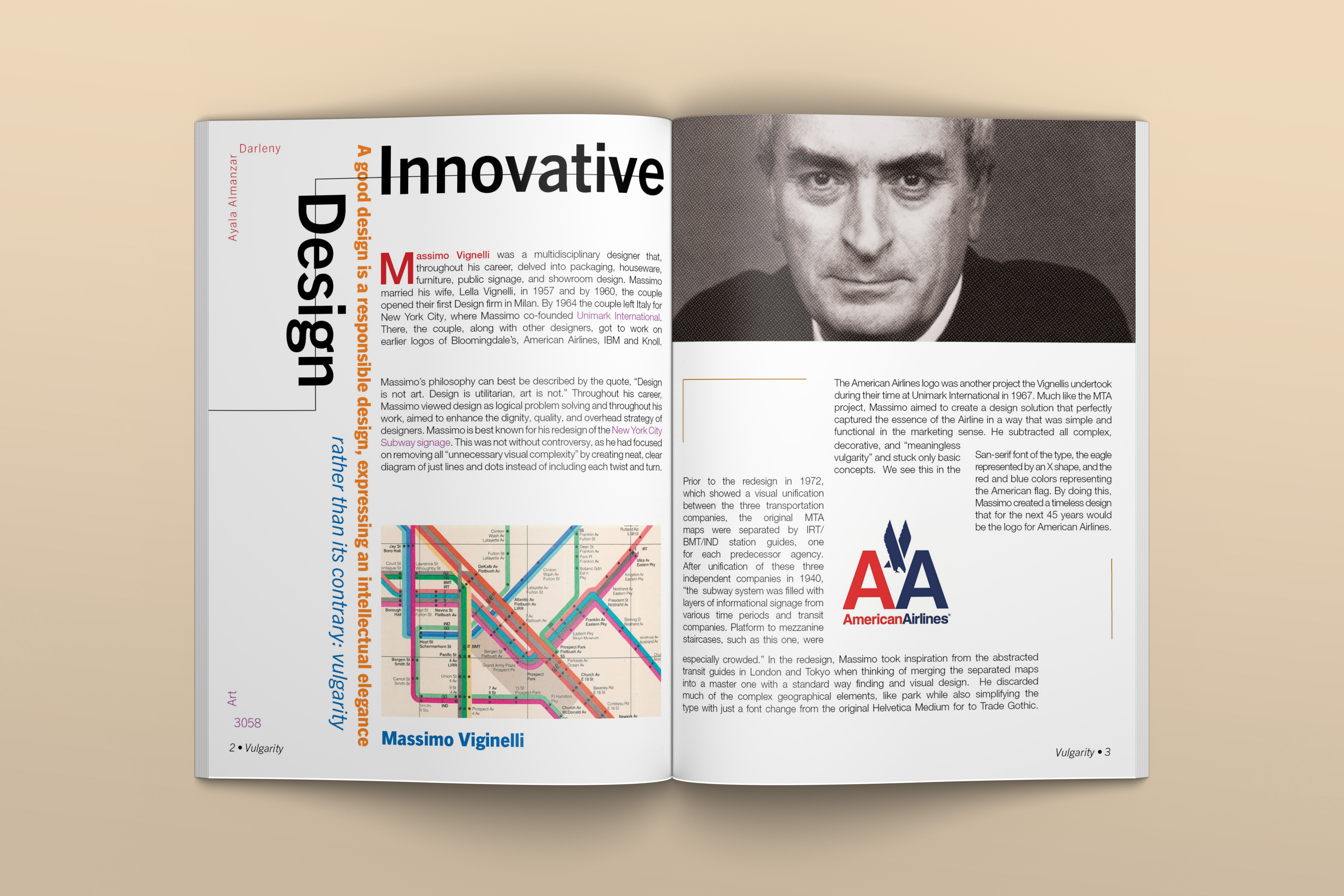
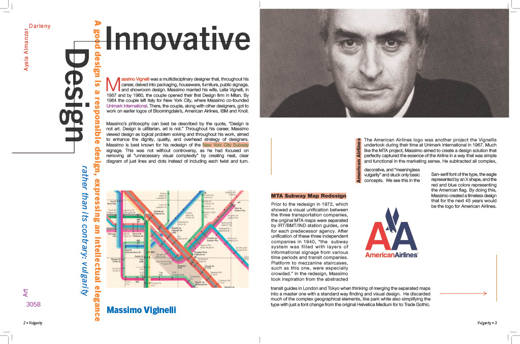
This project was an in-depth exploration of the life and design philosophy of Massimo Vignelli. Inspired by his legendary subway map redesign for the Metropolitan Transportation Authority (MTA), I crafted an editorial article and magazine spread that not only informed readers about his legacy but also mimicked his signature design principles. The goal was to embody Vignelli’s ideology of “expressing intellectual elegance rather than vulgarity” through a structured and intentional layout.
I started by researching on Vignelli’s life, philosophy, and two of his most iconic works: the 1972 NYC Subway Map and the American Airlines logo redesign. Vignelli's style can best be summarized by the following quote:
Design is not art. Design is utilitarian, art is not.
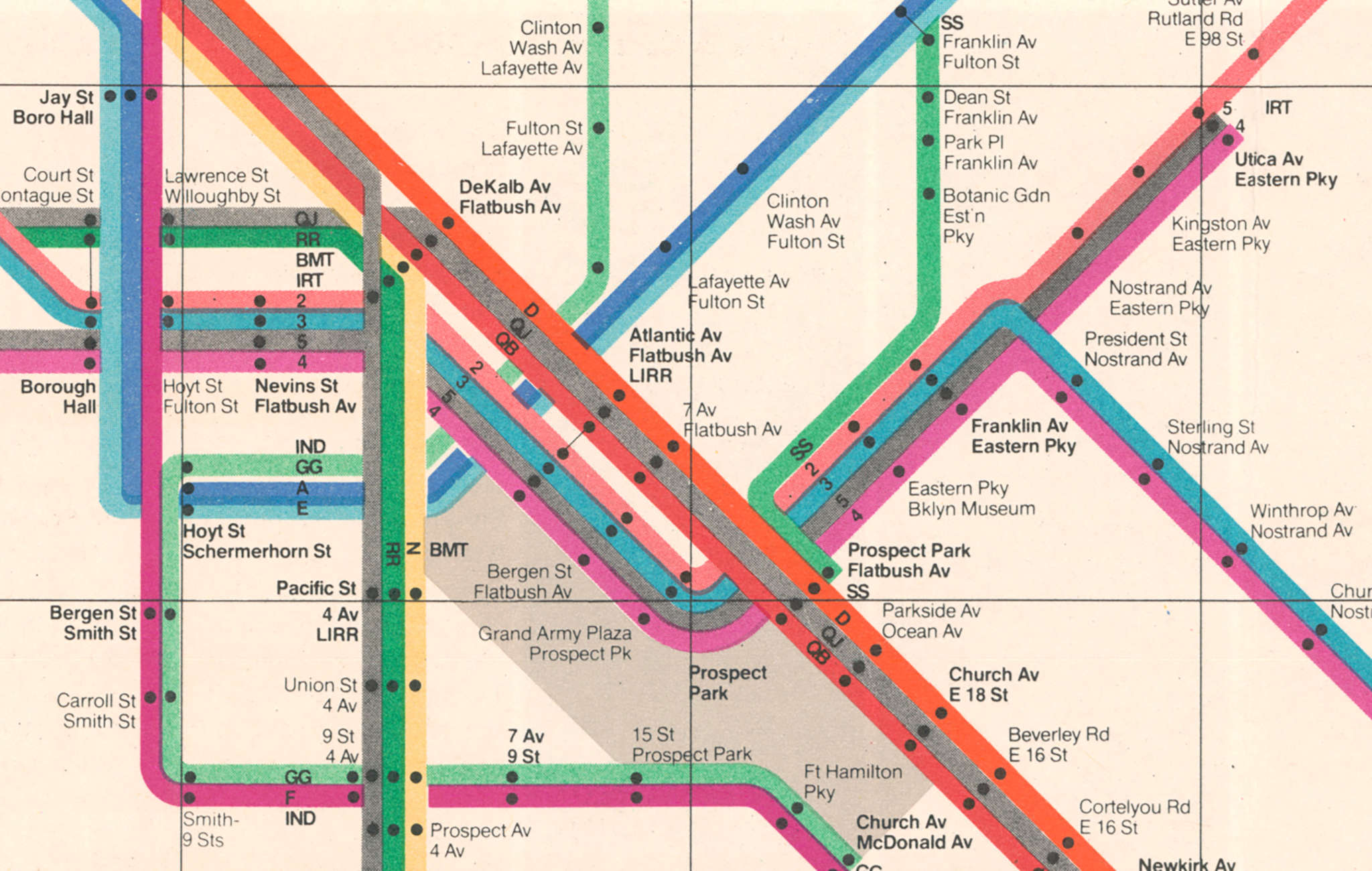
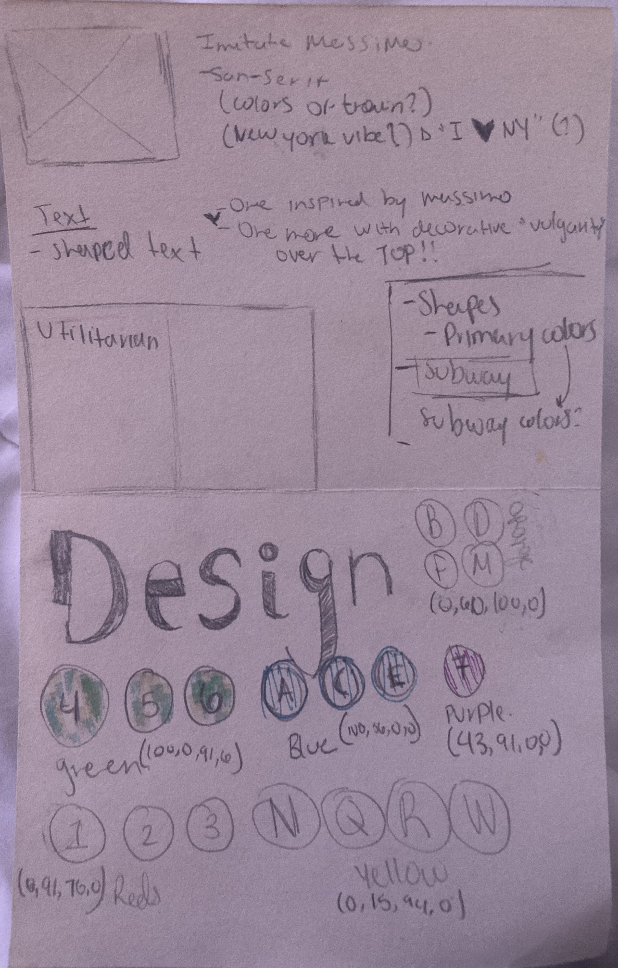
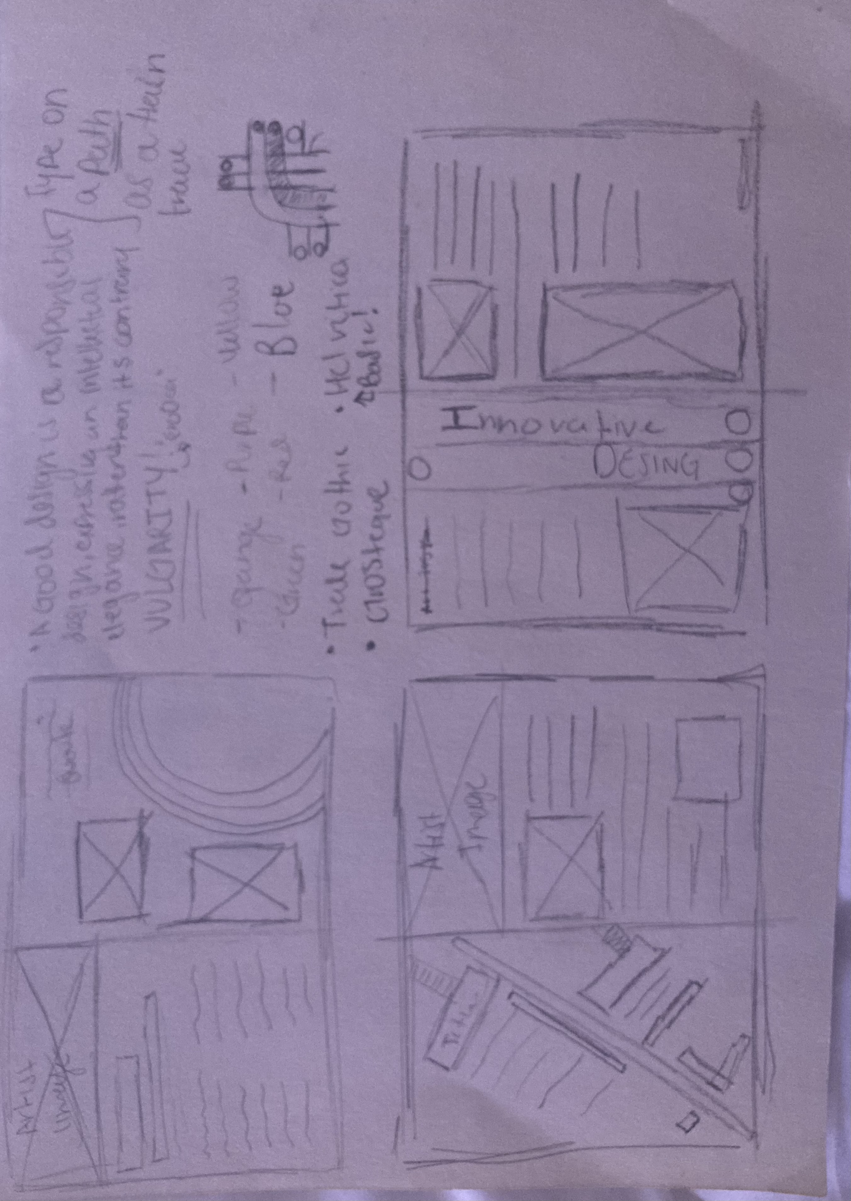
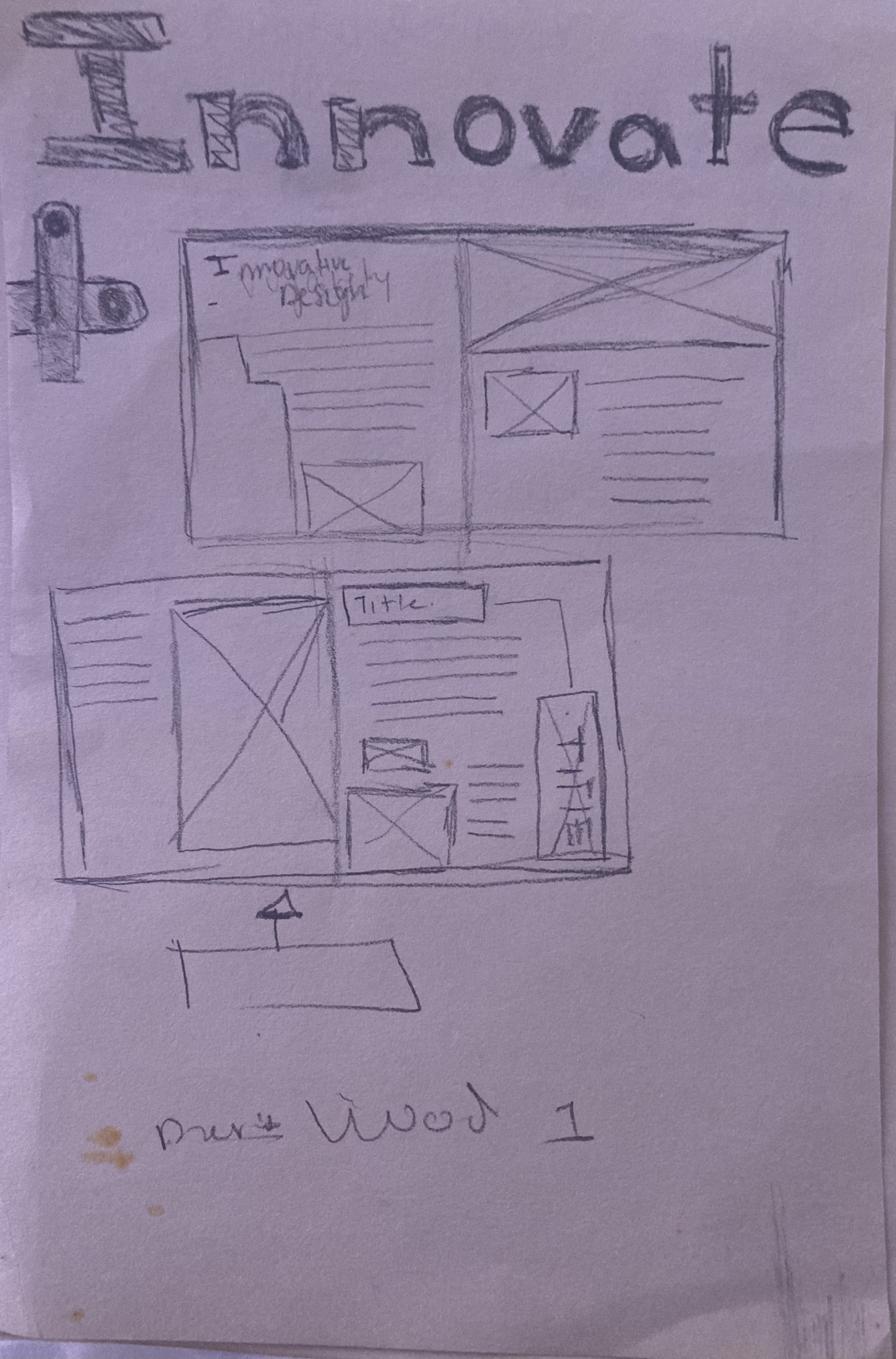
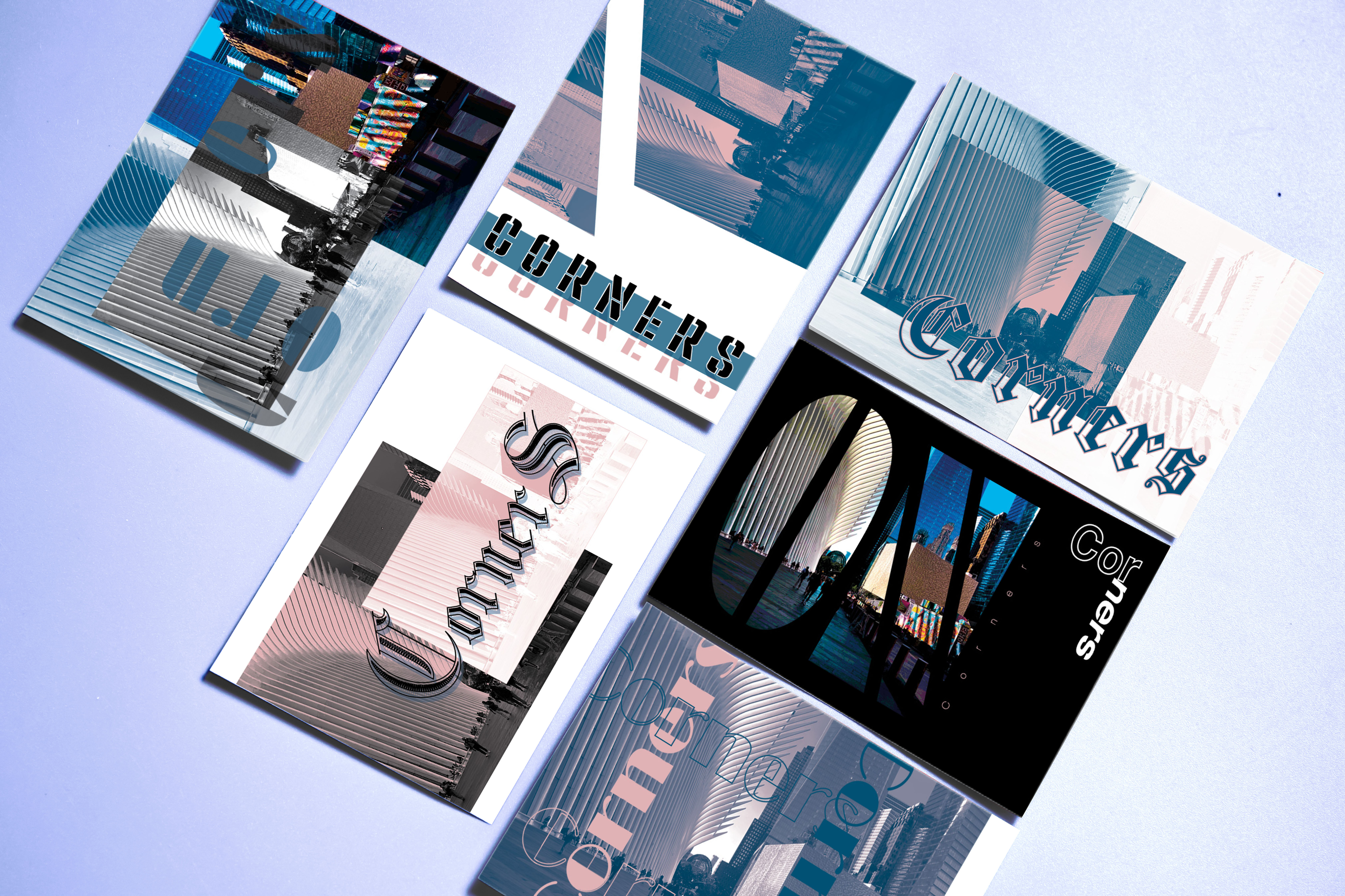
Considering his lengendary MTA Design, I drew inspiration from his simplified version of the MTA map. In my first sketches, I considered the colors, layout, and fonts I wanted to use for my editorial. Selected fonts that mirrored his preference for sans-serif typefaces like Helvetica. I implemented color choices inspired by the NYC subway lines, bringing a subtle but meaningful nod to his work. I also integrated high-resolution, CMYK-processed images, including a portrait of Vignelli, his subway map, and the American Airlines logo.
#9A38A1
#D82233
#EB6800
#0062CF
One of the biggest challenges was balancing visual hierarchy while maintaining a minimalist aesthetic. Initially, my design included unnecessary decorative elements that deviated from Vignelli’s strict functionalism.
Another challenge was adjusting the spacing of the justified texted. Removing it was not an option for me since It helped to create a visual appeal to the white space. After receiving feedback (in image below, feedback in red), I refined the layout by eliminating clutter with the headlines and reinforcing alignment with a structured grid. Adjusting color contrast and typography weights also helped achieve a harmonious balance between modernism and readability.
This was my first time working on a magazine publication and following strict guidelines. However, I gained a deeper understanding of editorial design and how to structure magazine spreads for professional publications. I also learned how to analyze design works critically and translateinto visual storytelling which overall strengthened my ability to use grids and typography to create a cohesive and aesthetically refined layout.
This project was an invaluable exercise in studying the impact of modernist design principles. By emulating Massimo Vignelli’s approach, I enhanced my ability to design with intention, clarity, and functionality. This article now stands as a strong addition to my portfolio, showcasing my ability to merge research, design, and storytelling in a professional format.