MATTO Espresso is a New York City-based coffee brand dedicated to delivering high-quality coffee and baked goods at an accessible price. These seasonal designs were conducted as part of a marketing initiative called The "Wake Up Meal" aiming to make MATTO Espresso a go-to breakfast destination for busy professionals, students, art enthusiasts, and health-conscious individuals.
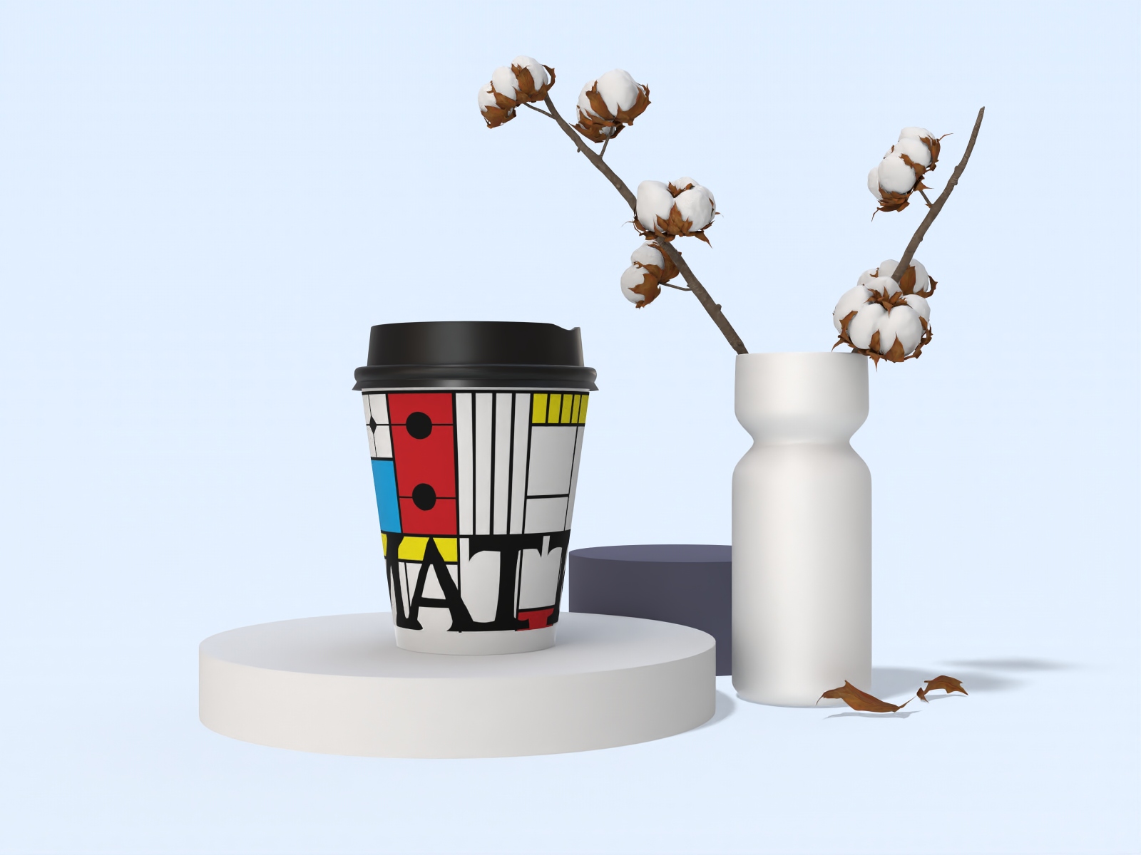
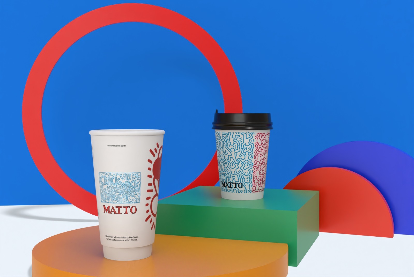
Each design features a season and art movement/artist, including, Bauhaus, Modern, Pop Art, and the Renaissance.
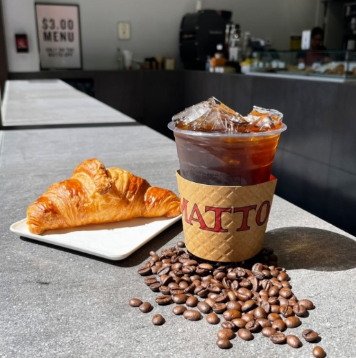
Founded in 2016, Matto captures the essence of Italian coffee culture, offering freshly brewed espresso, pastries, sandwiches, and snacks. The concept for Matto emerged from the realization that espresso could be enjoyed at any cafe in Italy, regardless of its setting.
This inspired the creation of a coffee shop that mirrored that experience but made it affordable and convenient for a broader audience in NYC. Matto emphasizes consistency in quality, sourcing its beans from premium Italian roasters while ensuring every cup meets high standards. The brand is also known for its innovation, such as, social media marketing successes, including viral campaigns like its signature Banana Date Latte video.
The goal of the "Wake Up Meal" marketing plan is to establish Matto Espresso as the go-to breakfast destination for busy professionals, students, art enthusiasts, and health-conscious individuals.
The campaign will focus on enhancing brand visibility and customer engagement through digital channels, with a target of achieving 70% of sales via the app.
As the product designer, I was responsible for designing what the product packaging would look like and were to supplement our concept for the seasonal “Wake Up Meal.”
When starting this design, I wanted to ensure that the cups felt simple, direct, and reflective of New York City’s fast-paced creative energy. I also wanted to bring added vibrancy to the original MATTO designs while respecting the brand’s established identity.
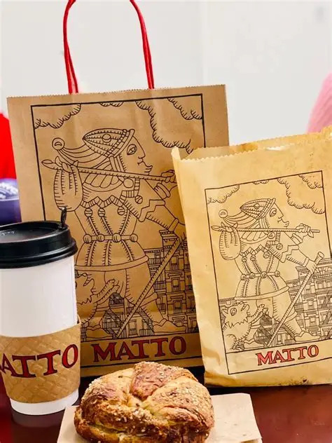
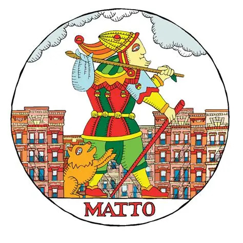
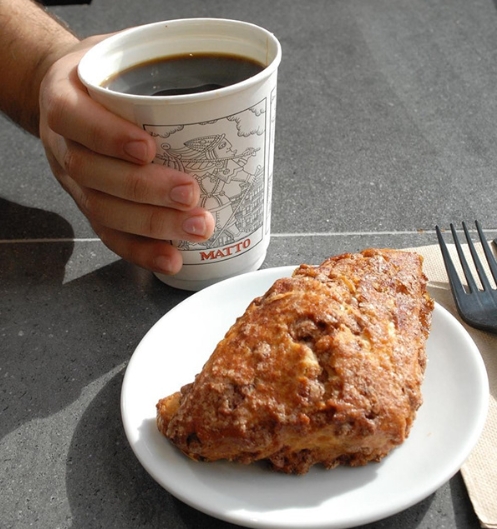
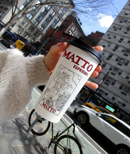
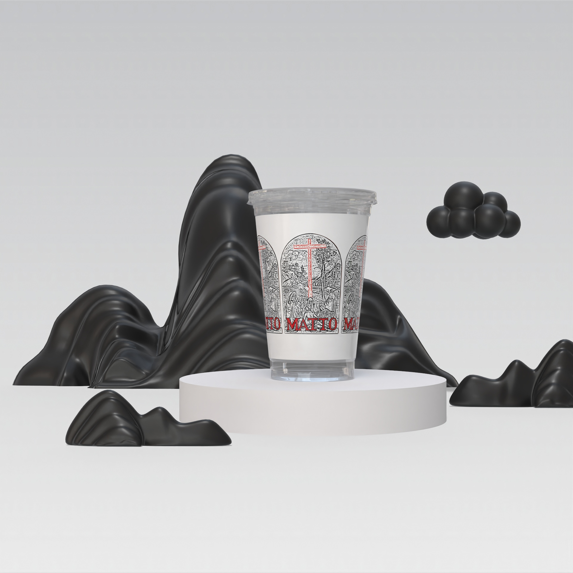
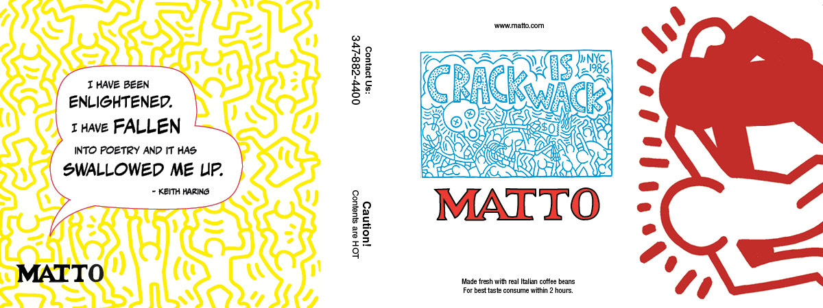
The original MATTO packaging is classic, featuring a stencil-style illustration of The Fool from the Tarot card deck which is an extremely unique and highly recognizable visual element. Because of that strong foundation, I approached the redesign as an enhancement rather than a replacement.
I began by researching MATTO’s current branding, customer demographics, and social media presence to understand how the company connects with its audience. I then explored how limited-edition packaging could create excitement, encourage repeat purchases, and make the seasonal launch feel collectible. Since the campaign centered around art enthusiasts, students, and busy professionals, I used art history and cultural references as the creative direction for each cup.
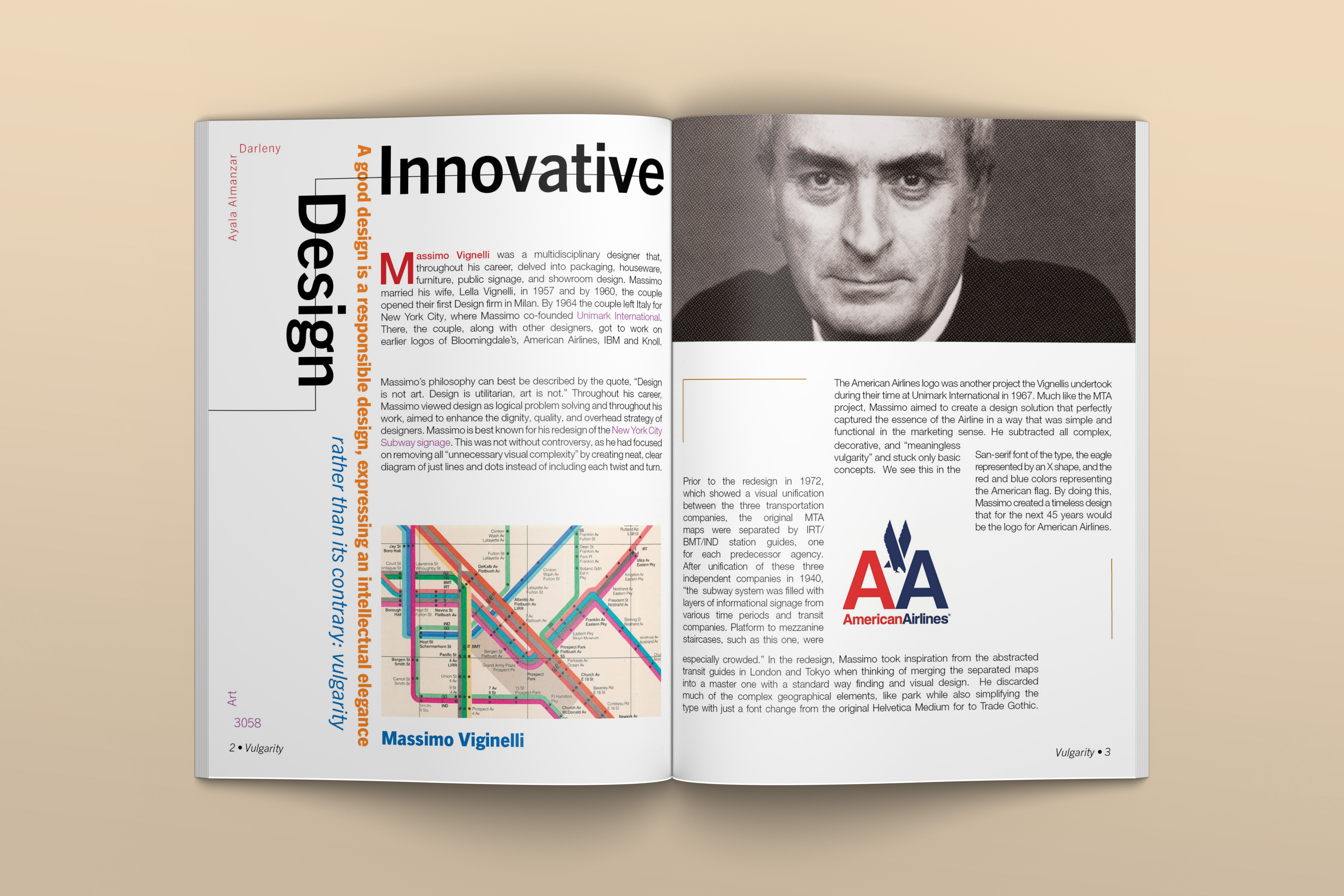
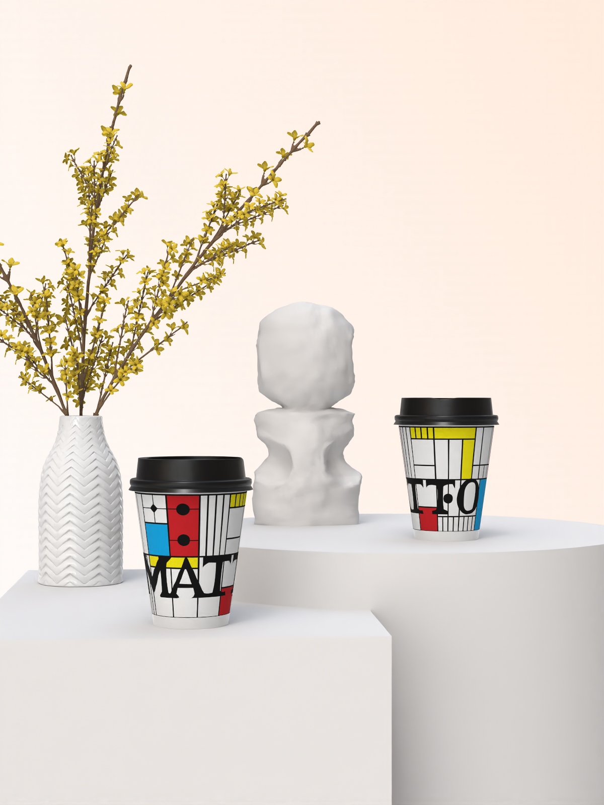
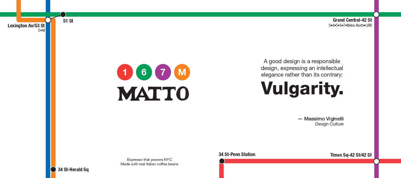
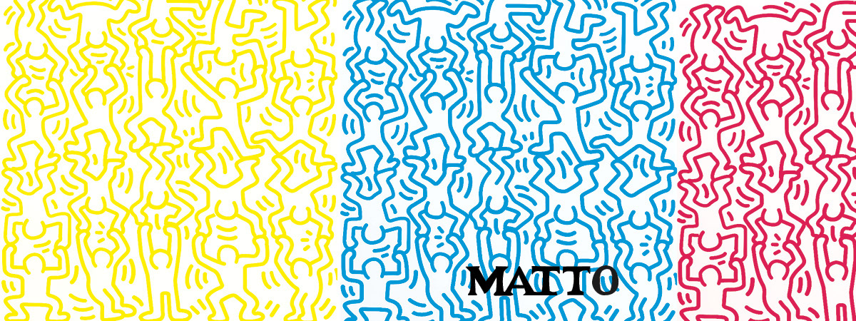
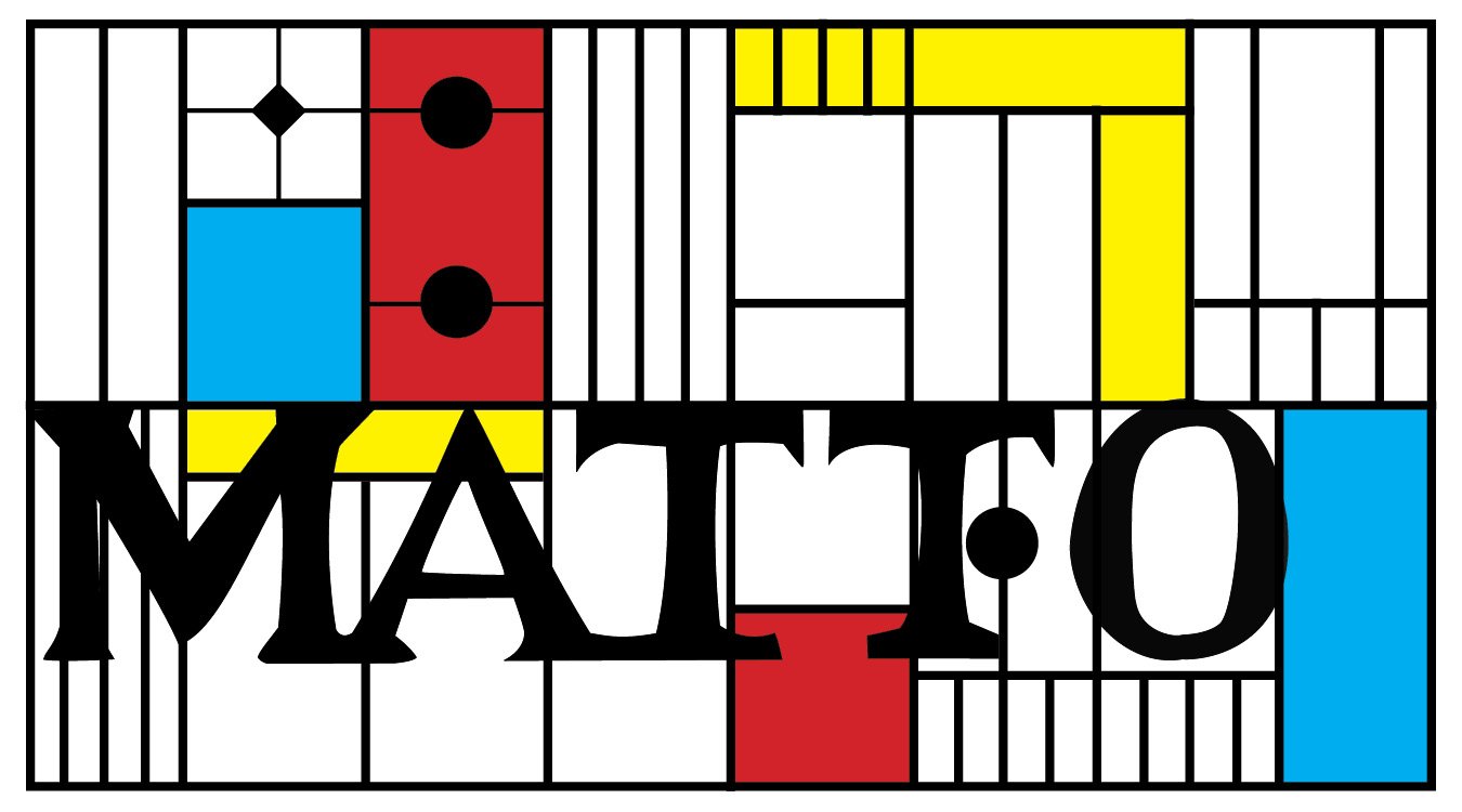
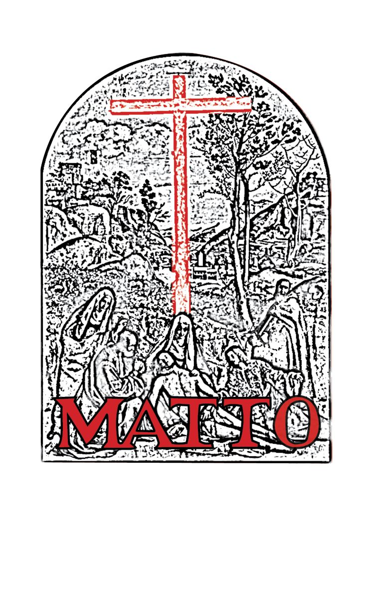
From there, I developed four seasonal concepts, each tied to a different art movement or artist. For Spring, I referenced Massimo Vignelli and modernist design through bold geometry and structured layouts inspired by the NYC subway map. Summer featured Keith Haring and Pop Art, using bright colors, movement, and playful energy. Fall drew from Italian Futurism and Umberto Boccioni, emphasizing speed, motion, and layered forms. Winter referenced the Renaissance through classical imagery and a more elegant, heritage-inspired visual language.
Once the concepts were finalized, I created digital mockups to test how each design wrapped around the cup, how the MATTO logo interacted with the artwork, and how the final products would appear in advertisements and social media campaigns. Throughout the process, I focused on making each cup visually distinct, instantly recognizable, and aligned with MATTO’s bold, accessible brand personality.
One of the main challenges of this project was designing within an already established brand identity.
MATTO has a recognizable minimalist aesthetic, strong red logo, and affordability-focused positioning, so the seasonal cup designs needed to feel fresh and collectible without losing the familiarity of the brand. I had to find a balance between artistic expression and commercial functionality.
Another challenge was translating four very different art movements into a cup format with limited surface area. Each design had to be visually distinct while still remaining legible, scalable, and easy to recognize in-store or through social media content. Since coffee cups are viewed quickly and often in motion, the graphics needed to communicate instantly.
Additionally, because this project was part of a larger marketing plan, the designs needed to support broader business goals such as customer engagement, app downloads, repeat purchases, and seasonal excitement. This meant thinking beyond aesthetics and considering how packaging could drive behavior and strengthen customer loyalty.
This project taught me how packaging design can function as both branding and storytelling. I learned that even a small object like a coffee cup can create emotional connection, collectibility, and social engagement when designed thoughtfully. It also strengthened my ability to design within constraints, adapt visuals to three-dimensional products, and connect creative decisions to marketing objectives.
Most importantly, the project showed me how design can elevate everyday experiences. By turning a disposable coffee cup into a seasonal collectible inspired by art history, I was able to create something functional, memorable, and aligned with MATTO’s identity.