For my final project, I decided to embark on a perfume redesign within Maison Margiela’s Replica series. Inspired by the existing Replica Jazz Club perfume, I initially struggled with identifying areas for improvement due to its well-crafted and modern design. However, through iterations and research, I developed an entirely new concept that encapsulates a feminine, romantic, and nostalgic atmosphere inspired by Havana’s vibrant nightlife.
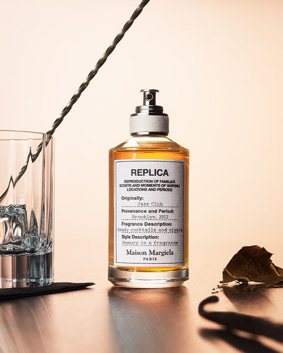
At the start of this project, I assumed that my task was to redesign the original Jazz Club perfume. I remember thinking that the original packaging was already perfect, in the sense that through its minimalism it captured the essence of the male audience it wanted to serve, despite being a unisex perfume. I searched the Margiela Official to understand the marketing point of the product and how to translate it over to the redesign.
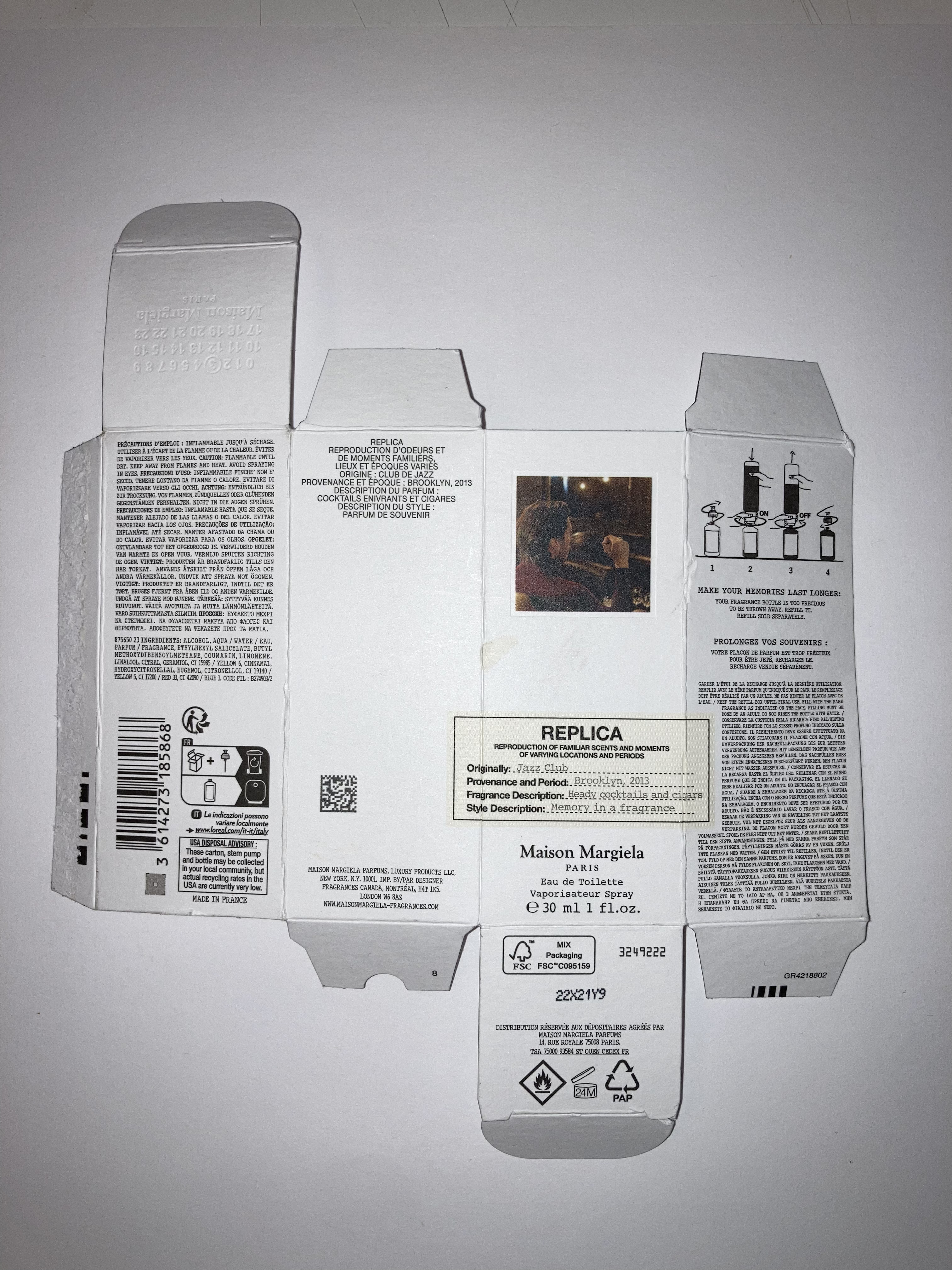
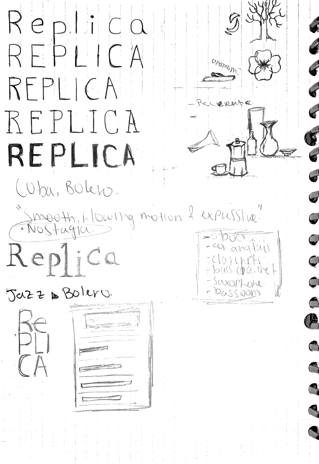
The Jazz Club perfume evokes the ambiance of a cozy basement bar in Brooklyn , filled with soft jazz melodies and a warm, smoky aroma. With this in mind I went through many sketch iterations to captivate this alluring, strong, masculine sentiment I got from the smell and look of the product.
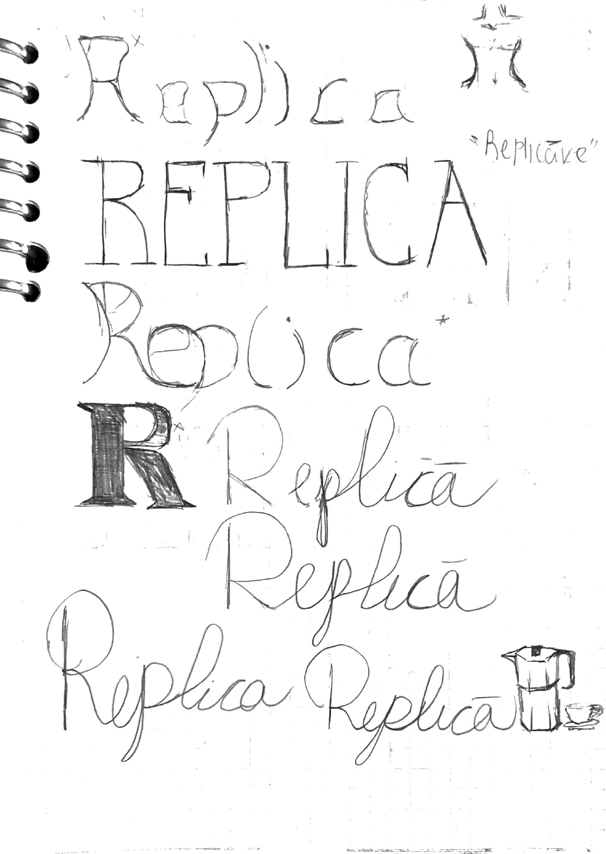
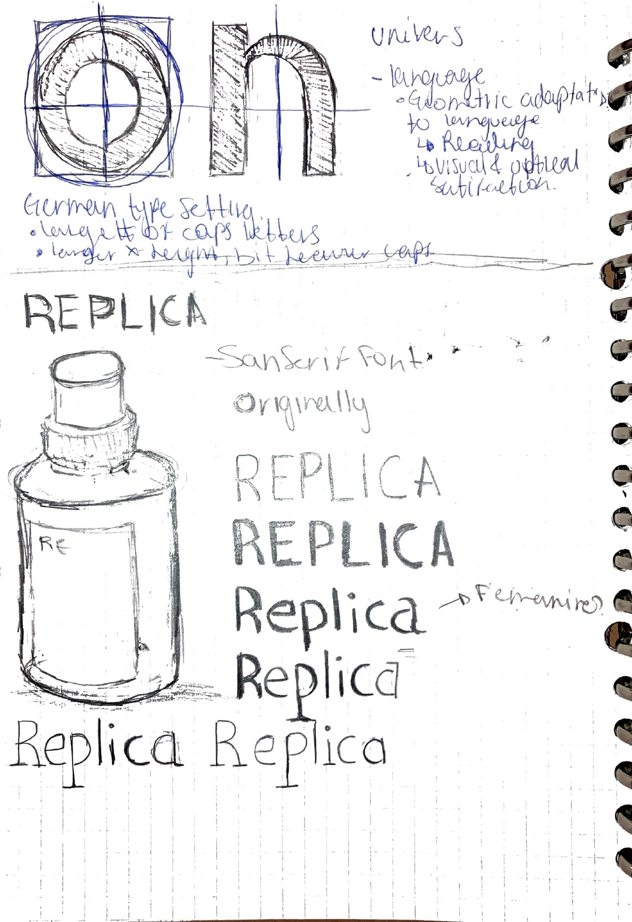
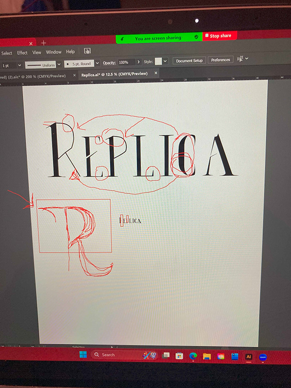
One of the early challenges in this project was creating a fitting letter type for the Replica logo.
Initially, I believed we had to replicate the Jazz Club branding, as shown by my sketches above, which leaned toward a masculine aesthetic. My research on Margiela’s marketing approach helped me understand the importance of translating a sensory experience into visual design.
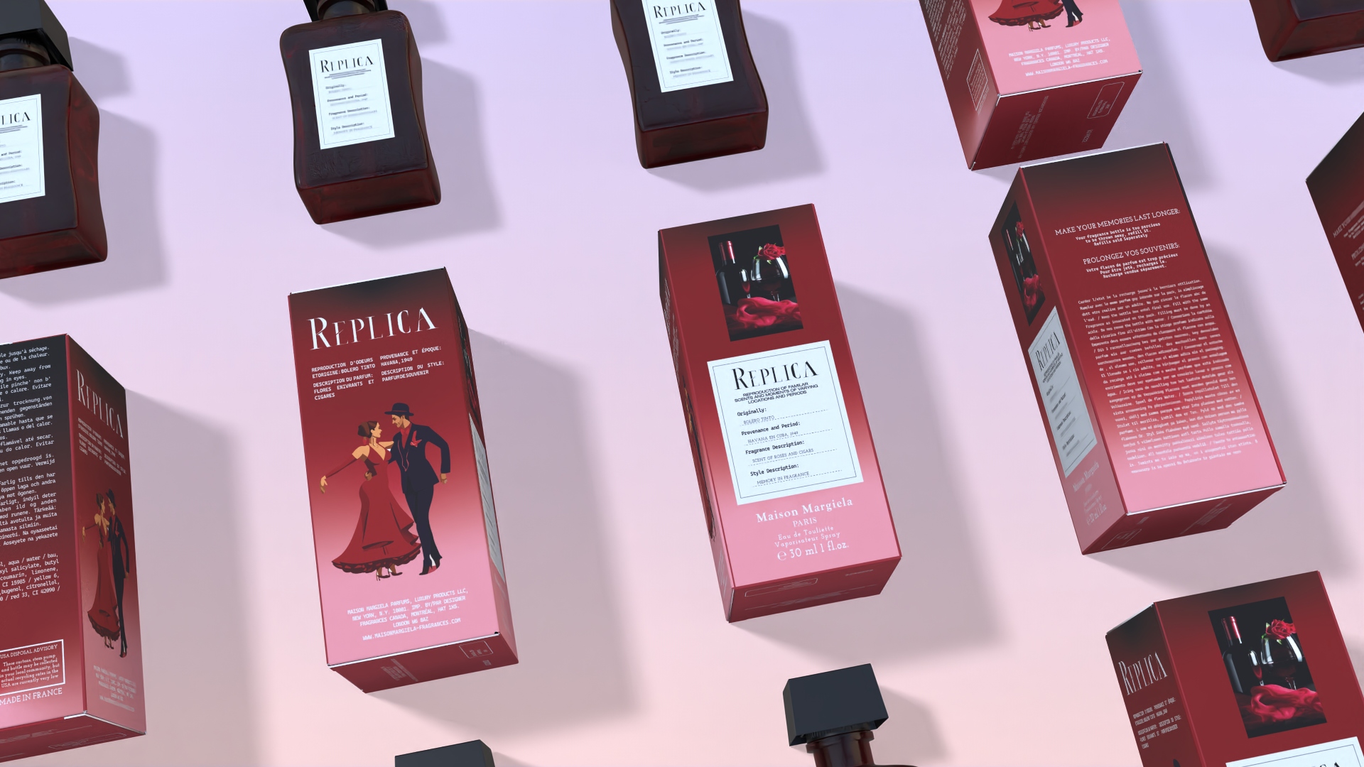
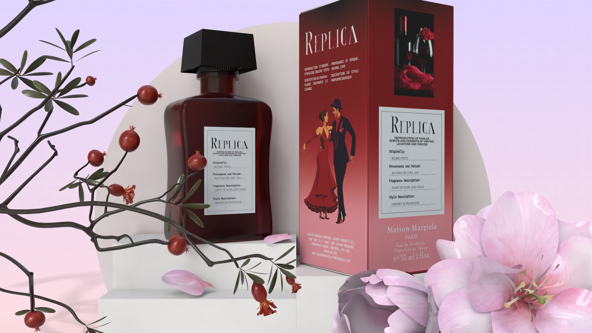
Wanting to maintain this nostalgic sentiment but with a more feminine touch, I pivoted my concept to reflect a Havana nightclub filled with the soft sounds of Bolero music.
My main inspiration came from Omara Portuondo, a Cuban singer known for her romantic and soulful Bolero music. Her style and artistry guided my vision, leading me to craft a fragrance that reflects warmth, passion, and the delicate yet bold essence of Cuban nightlife.
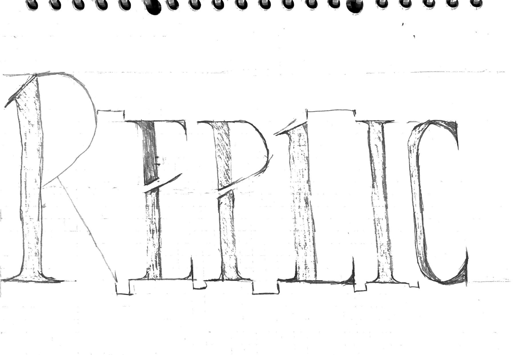
For the typography, I aimed for a bold, striking serif font reminiscent of long red claw nails that symbolized both passion and sophistication. My first type design, however, had inconsistencies in the serifs, with some appearing straight slab while others slanted left. Additionally, the details in letters like “R” and “P” became less readable in smaller sizes.
.png)
After receiving feedback, I refined the type by removing the slanted serifs and adding thicker strokes to the inner curves of the letters. This adjustment created better balance and harmony within the typeface, enhancing its readability and elegance, especially when down scaled.
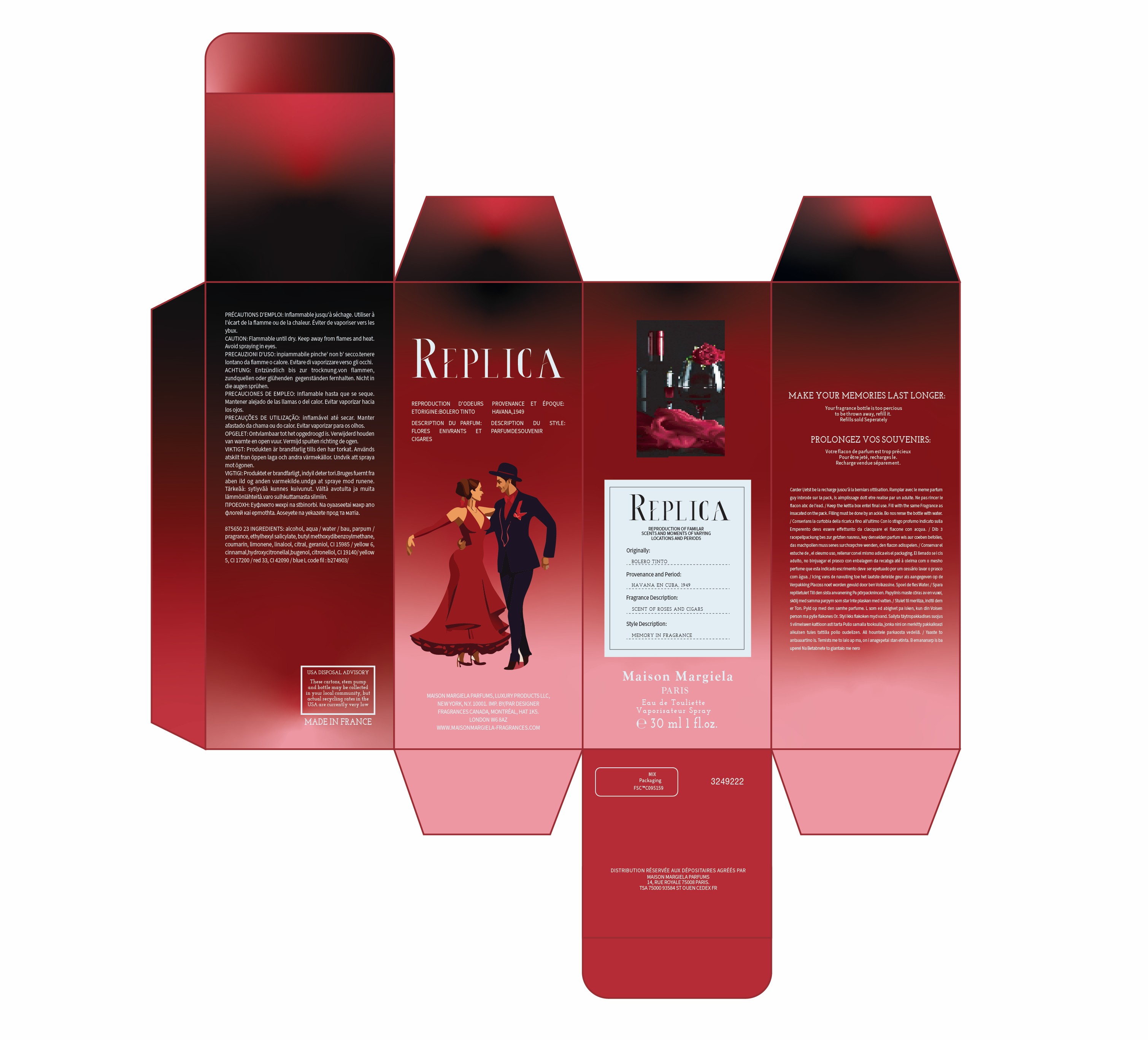
One of my biggest critiques of the original Jazz Club packaging was the readability of smaller letters. The all-caps body text and low contrast made it difficult to read. To improve this, I introduced lowercase lettering for the body text and bolded certain sections to create better contrast between different languages on the packaging.
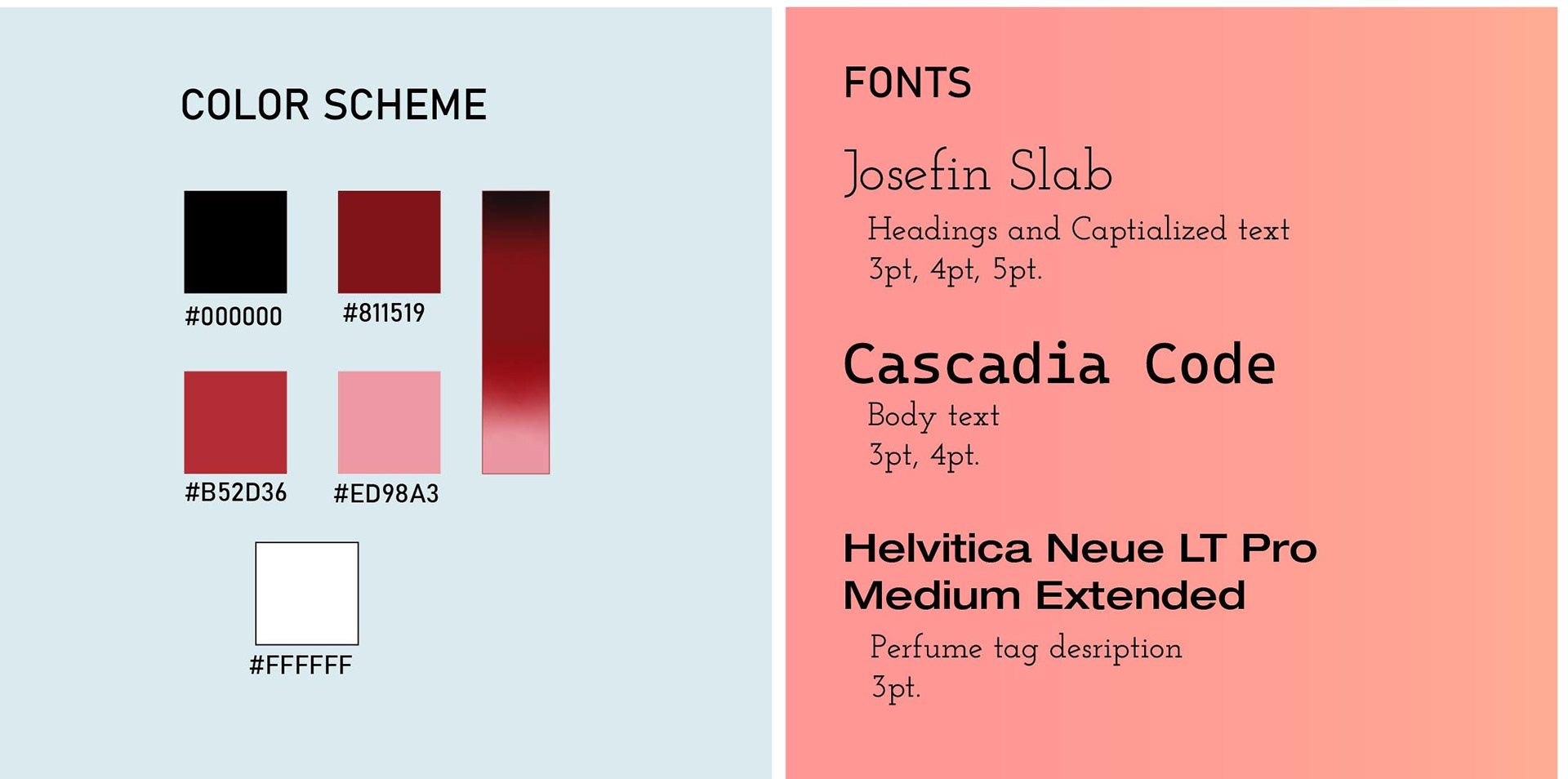
For the packaging visuals, I incorporated deep reds and warm tones to evoke the romance and vibrancy of Havana nightlife. The illustration on the box depicts a dancing couple, reinforcing the passionate, intimate atmosphere of a Bolero bar. Additionally, floral and organic elements further enhance the theme, connecting the scent profile to its visual identity.
This project was a rewarding challenge that allowed me to experiment with branding, typography, and sensory storytelling. Through research, multiple iterations, and careful refinement, I developed a perfume design that captures the essence of Havana’s romantic and nostalgic charm. The final result balances boldness and elegance, making it a strong addition to the Replica series by Maison Margiela.